
Sprintify is a start-up from Auckland, New Zealand that will launch in 2020. Their vision is to disrupt business-as-usual and create a breakthrough framework for goal attainment. I was brought on to create the brand and digital product from the ground-up. With the product prelaunch and under NDA, the below case study explores the creation of the brand identity.
Discover
Productizing a methodology.
To kick-off our engagement I went through some discovery sessions with the client to find out more about her motivations. The founder, having spent many years running high-caliber international sports events had developed a framework and personal expertise for achieving goals that proved extremely effective in high-pressure environments. It was her mission to share this with the world by developing a marketable product based on her methodology.

Setting objectives.
From here we could set our objectives for Phase 1 of the project:
01 Understand the problem space and map the founder's current-state service methodology.
02 Foster creative collaboration to imagine the future-state service eco-system.
03 Build the business's understanding of human-centered design methods and foster empathy with user needs.
04 Create a strong brand identity that resonates with the business and users.

Adopting an approach.
Phase one of the engagement was to create the brand identity, with the 'Brand Guidelines' deck as a deliverable. I kicked things off with some user and market research which helped identify our target segment. From there we developed a strategy for integrating user-centered design methods into the project.

Core user needs.
After some time exploring the problem space we could articulate the core pain points for users:
01 Employees of corporations lamented how their boss was the real blocker to innovation and transformative change in their workplace - we had to ensure buy-in to our new framework came from all levels of stakeholders, especially key decision-makers.
02 Users were flummoxed by the amount of project management tools available to them - it had to be worth their time to adopt in the long-term.
03 Users were frightened by the threat of failure after pushing a new framework on their team - the experience had to be proven successful and virtually infallible.

From archetype to persona.
We focused on two archetypes to develop as personas: The 'Champion' - a team leader frustrated with the status quo who wants to innovate faster; The 'Game Changer' - an individual not content to stay stagnant who wants to transform their work habits to improve their working life.

Define
Brand strategy.
To help distill and articulate the founder's vision, I developed a lean, ten-page brand strategy that articulated the brand pillars we needed in order to move forward - the vision, problem space, unique value prop, business values, brand profile, brand spirit, user personas, and brand promise.

Ideate
The mark explored.
My only mandate before getting started was ‘try to use the target logo’ the founder had a napkin sketch for. I started out by sketching out a variety of different concepts to fully investigate the intent and rationale behind our decisions for the design.

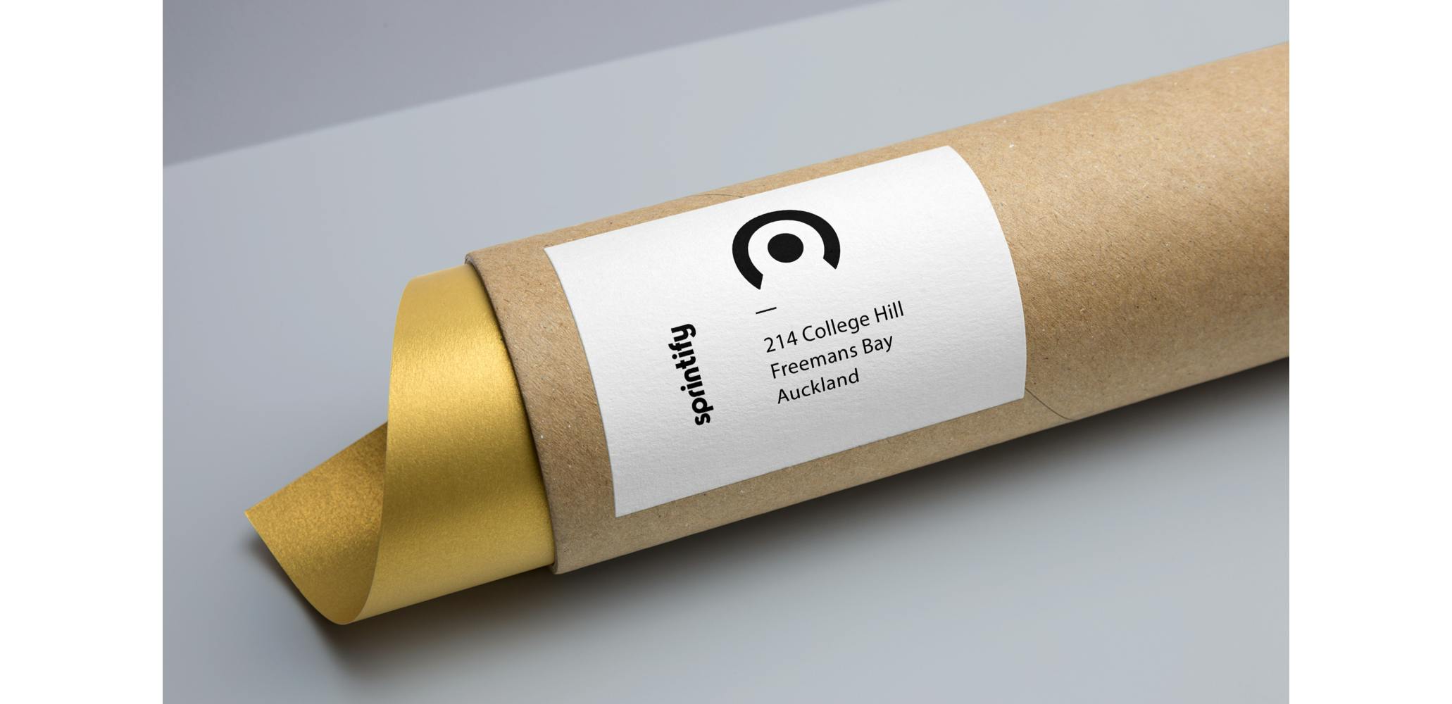
The brandmark.
Working with start-ups means you often start with a blank canvas. I left no stone unturned in the early stages by diving into many different visual styles to find what would resonate with the founder.

The brandmark.
With the target icon favored by the founder, we went through three iterations, narrowing in on options and getting more granular in the variations. We circulated these with an internal focus-group for feedback.

Implement
The brandmark finalized.
Through the discovery, the brand's personality started to take shape. The founder wanted something human-centered, yet professionally appealing to corporates. We went for a lower-case humanist typeface and the founder's beloved target logomark.

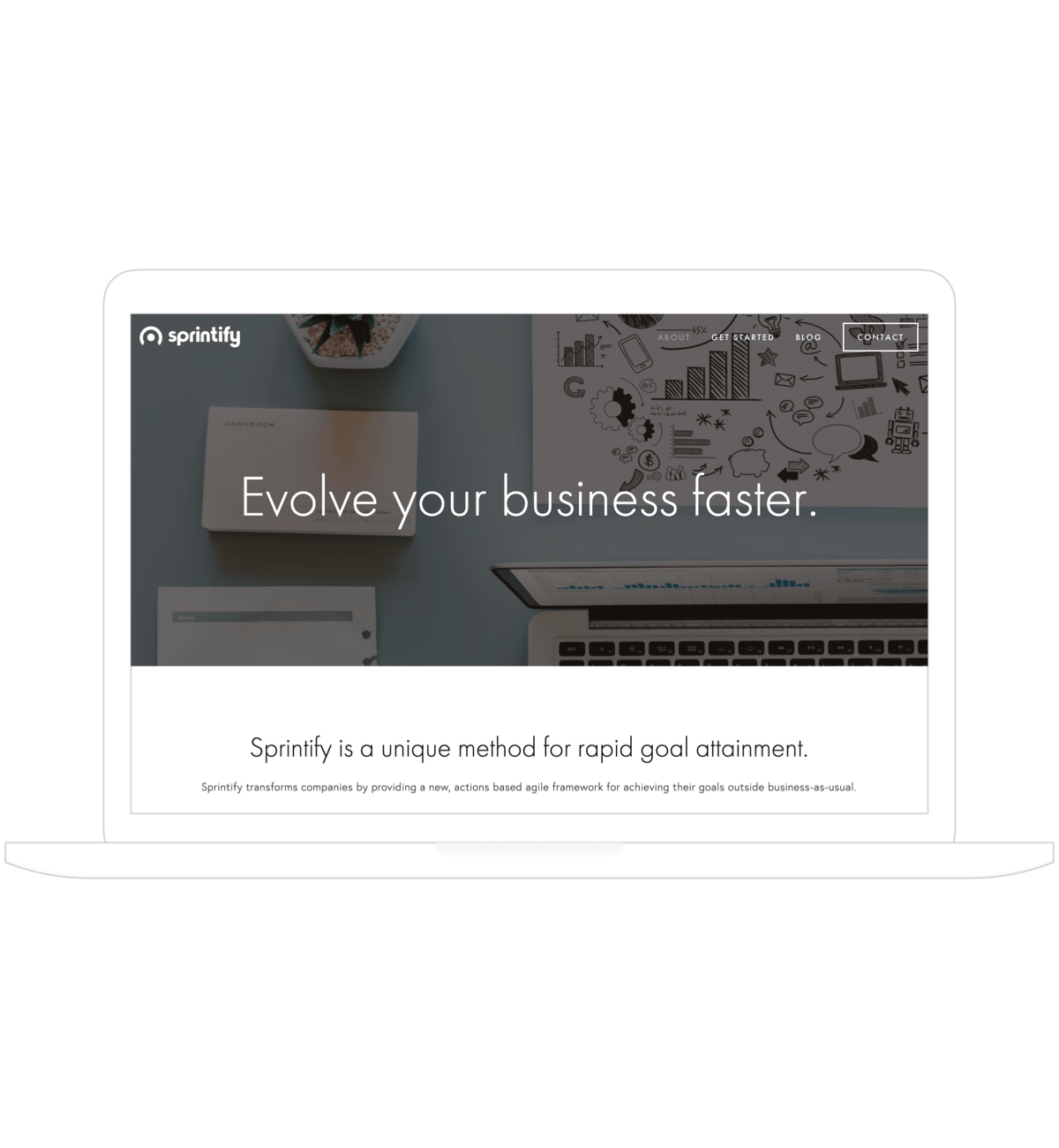
The digital presence.
By using a dark navy as the primary brand color offset by gold and greens, the brand has an earthy elegance that’s approachable yet refined. These colors were checked for appeal across the crucial digital touchpoints of mobile, web and the app icon.

Brand guidelines.
To finish off this phase of the engagement I produced the full brand guidelines, complete with chapters on the brandmark, the color palette, typography, print guidelines, UI recommendations, illustration, and imagery.

Website design sprint.
Looking ahead to the next phase, I worked with the founder to build an MVP business model prototype to user test the concept with an external focus group. Working on a shoe-string budget we built out an end-to-end user experience that included the operational framework, a marketing website, the 'Sprintify Handbook'.

Evaluate
Recapping objectives.
01 Understand the problem space and map the founder's current-state service methodology.
02 Foster creative collaboration to imagine the future-state service eco-system.
03 Build the business' understanding of human-centered design methods and foster empathy with user needs.
04 Create a strong brand identity that resonates with the business and users.
Assessing the impact.
Working with synergy and momentum, Phase 1 of the engagement rolled-out smoothly. The problem space was mapped with a future-state envisioned, with more work on refining this post user testing of the MVP. Human-centered design thinking has been adopted in Phase 1, with more work to do to fully embed this in the business culture in Phase 2. The brand identity has been designed with positive feedback from stakeholders and users. Sprintify looks to launch in 2020, there's lots more to come from this ambitious young brand.